Overview
NOTE TO READER: If you have already ready the Overview for: “(Part 2) Kanban Application - Development Stage:, you can skip the overview for this post because it is the same as the one you read. Go directly to Design Stage.
Introduction
I started this project because I needed to add more apps to my portfolio. I chose to build a Kanban web app because its just a little step more demanding than a todo list application. Plus I get the chance to practice drag and drop.
Problem
Kanban users love Kanban boards because they provide an easy way to visualise processes as well as task/project progression. Therefore the app should capture the essence of interacting with real life kanban boards. A major component of this experience is the ability to drag cards and list around.
The application is also required to be usable in all screen sizes. Therefore, the responsive design should be implemented.
Finally, the web application should be able to even when offline. Thus, the application should be a Progressive Web App (PWA).
Scope
- The app should allow the user to perform CRUD operations on boards, lists and cards.
- Only cards and lists shall be draggable.
- Card properties shall be limited to: title, description, due date, and a checklist.
- There will be no accounts page.
- The Will be no settings page.
- The will no theme selection.
- Tools used:
Design Stage
Process
Brainstorming
The process begun by looking at existing kanban board web apps such as Trello and Notion. By looking at the HTML structure and the CSS, I got a rough idea about how to implement certain features.
The next step was to get some design inspiration. I headed to dribbble and searched for kanban. My search yielded a lot of great designs. however, 2 designs captured my eye. These were:
- https://dribbble.com/shots/13008757-Submarine-Task-Manager-Kanban
- https://dribbble.com/shots/13240759-Project-Management-App
Sketches
I drew some sketches on how the design should look like before I started designing in Figma.
Images
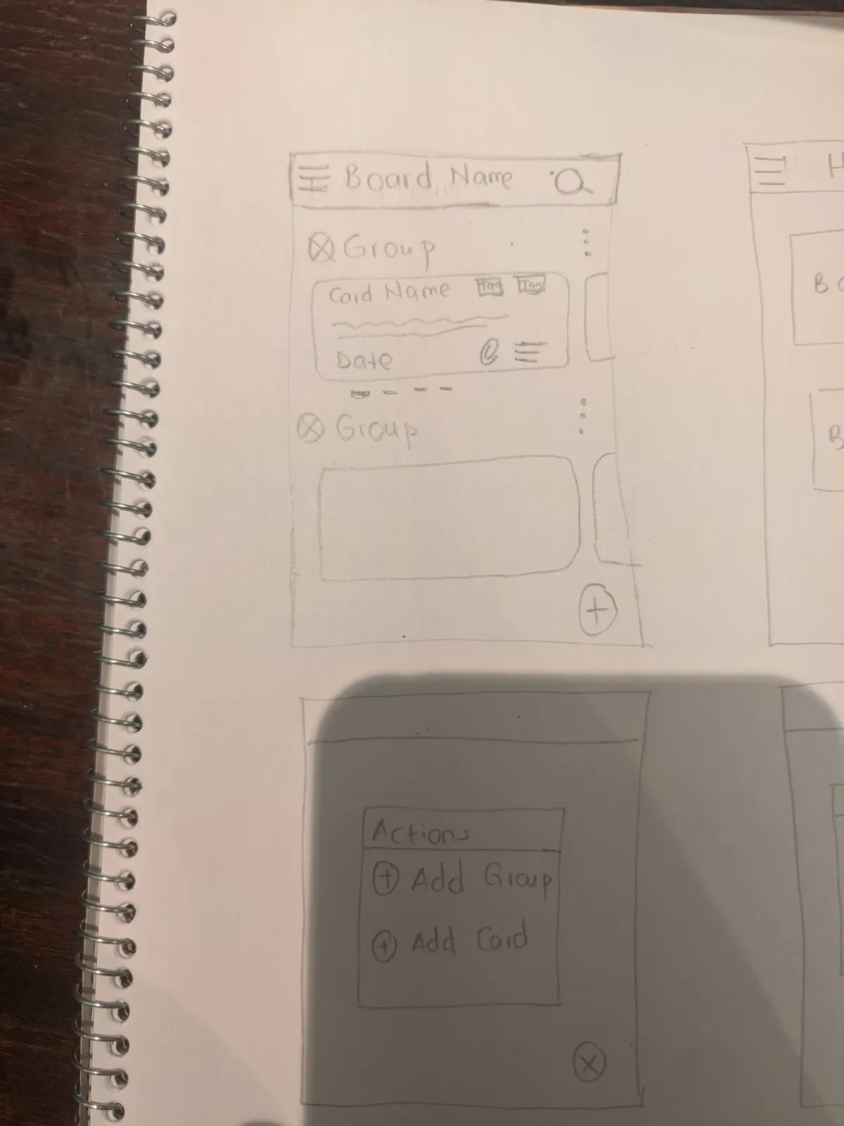
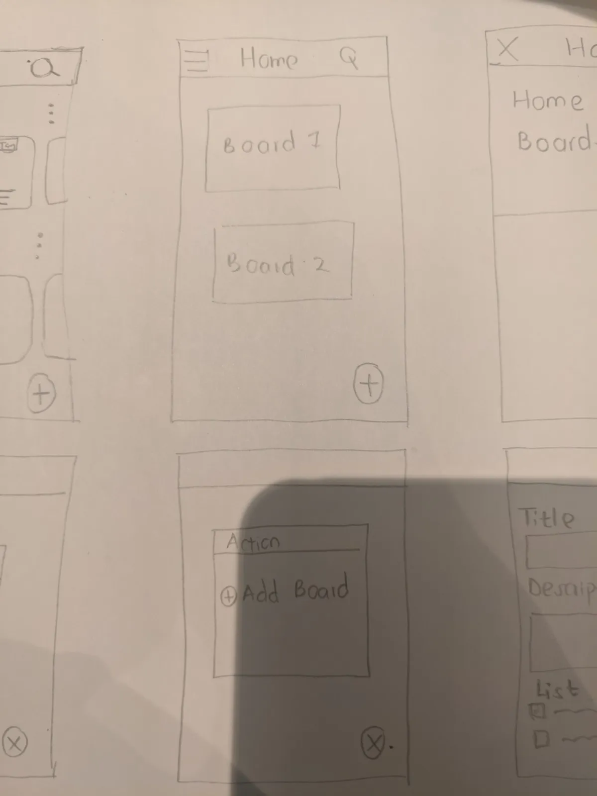
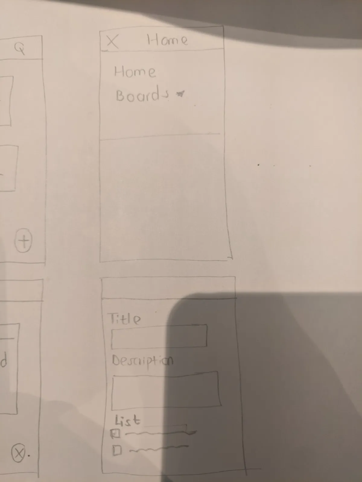
As you can see, I focused only in sketching the mobile version of the application. This is just to make things easy for me because I have learnt from experience that it’s easier to make a mobile application usable on the desktop than to make a desktop application usable on mobile.
Design System
I used a small-scale version of the Atomic Design System. I used all the levels except the Organism level.
- Pages ✅
- Templates ✅
- Organisms ❌
- Molecules ✅
- Atoms ✅
I find that I only need 4 levels for most projects. It saves me a lot of decision making.
Levels
1. Atoms
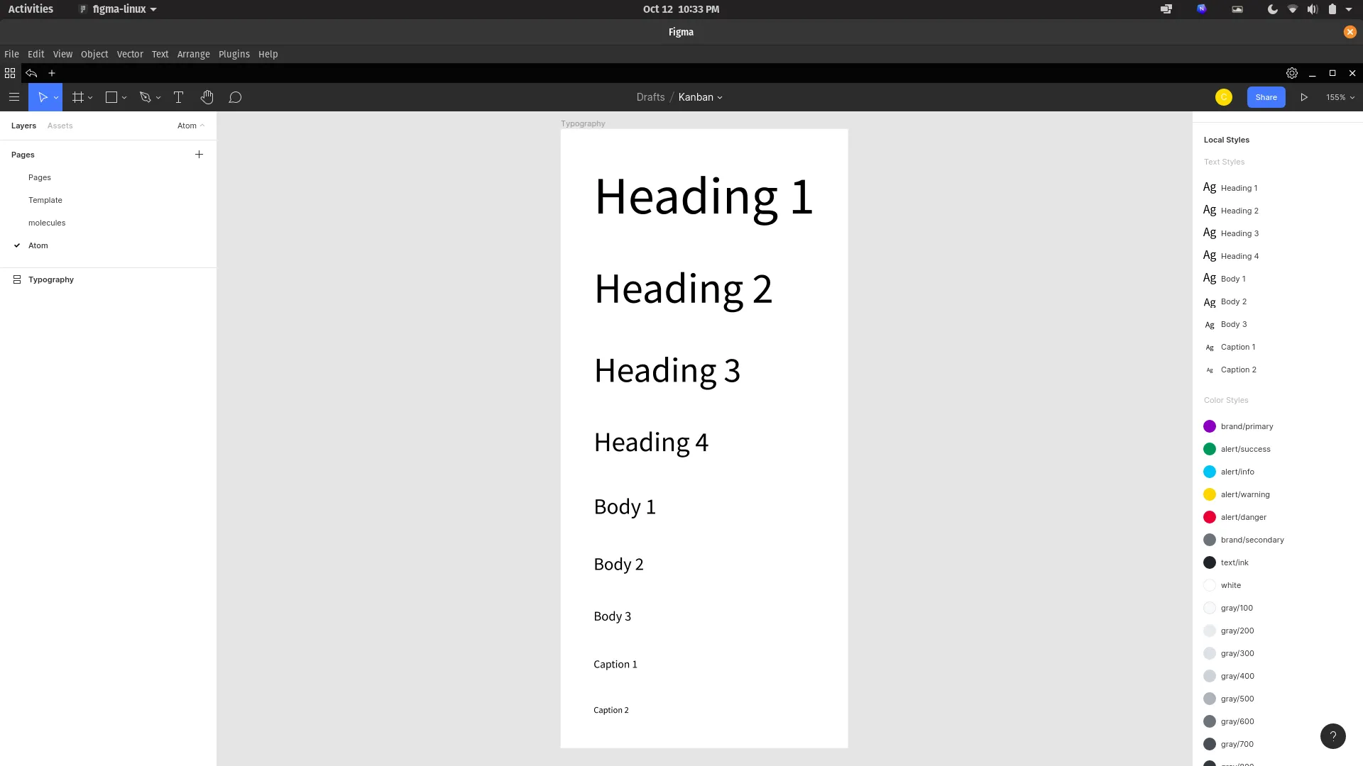
I usually use this level to set the typography, colors and other fundamental styles.
For typography, I used Tailwindcss’s Font Scale along with the Source Sans Pro font family.
For colors, I chose to uses Bootstraps default colors:
- the purple primary colors
- the grays
- the alert colors: info, success, warning and danger
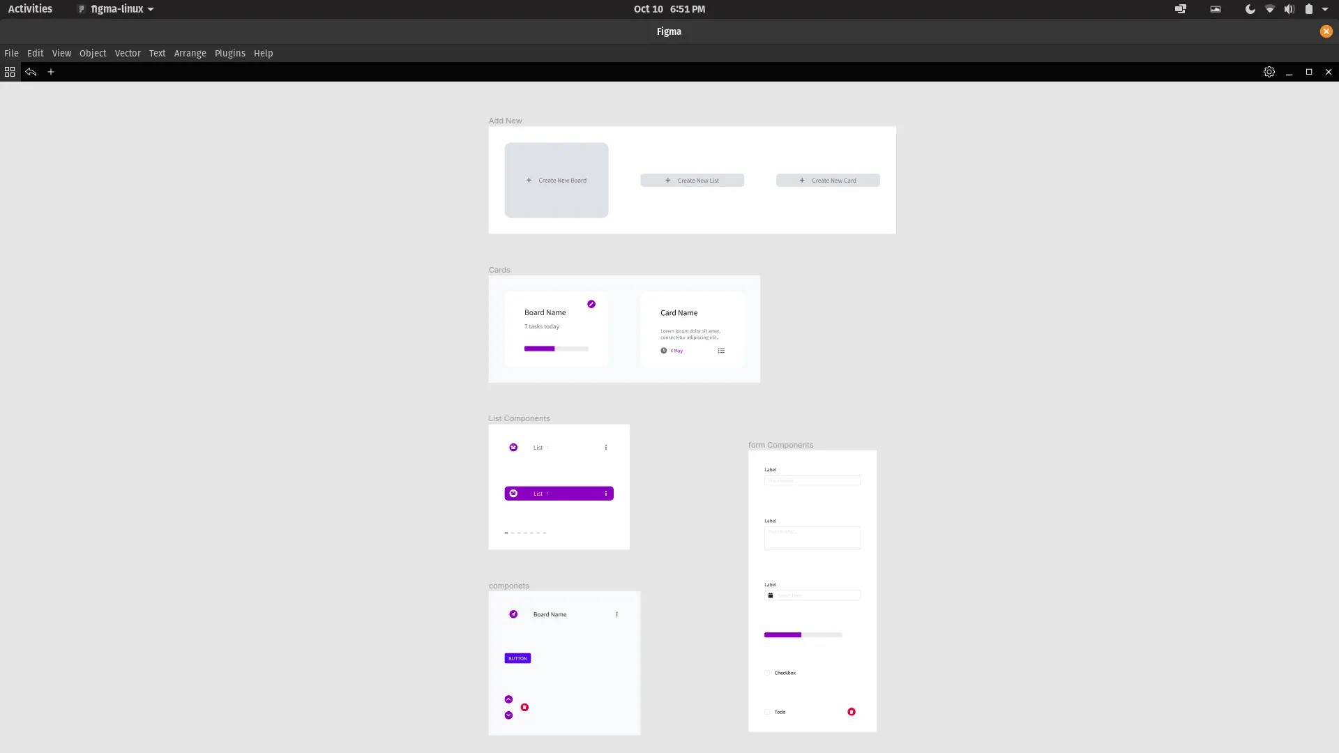
2. Molecules
I put all components,needed by Templates, in this level. These included:
- Elements needed by the List Component
- Form Elements
- Add New Buttons: Buttons to add new Board, List, and Card
- Card Components
- General Elements such a generic button.
3. Templates
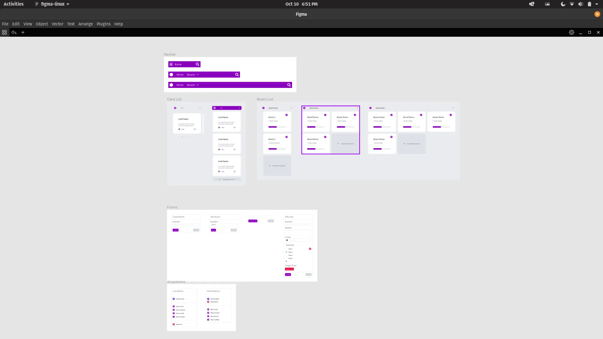
I included components, directly needed by Pages, in this level. These included:
- Navbar Components for all screen sizes
- Card List Component for mobile and another for both tablet and desktop
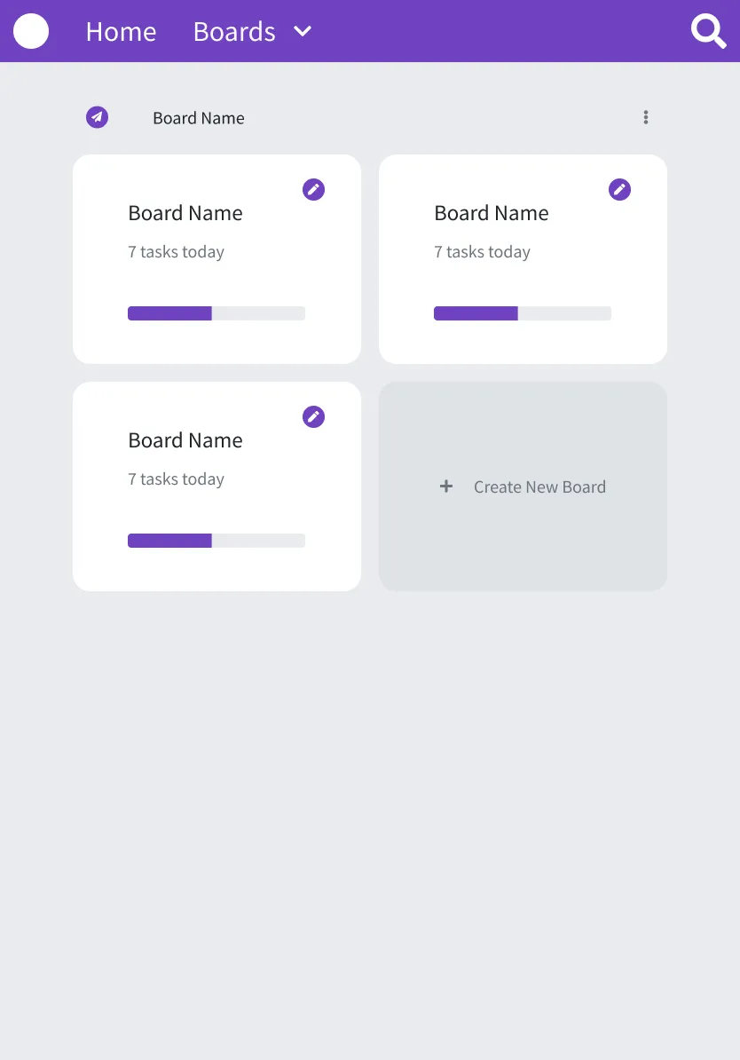
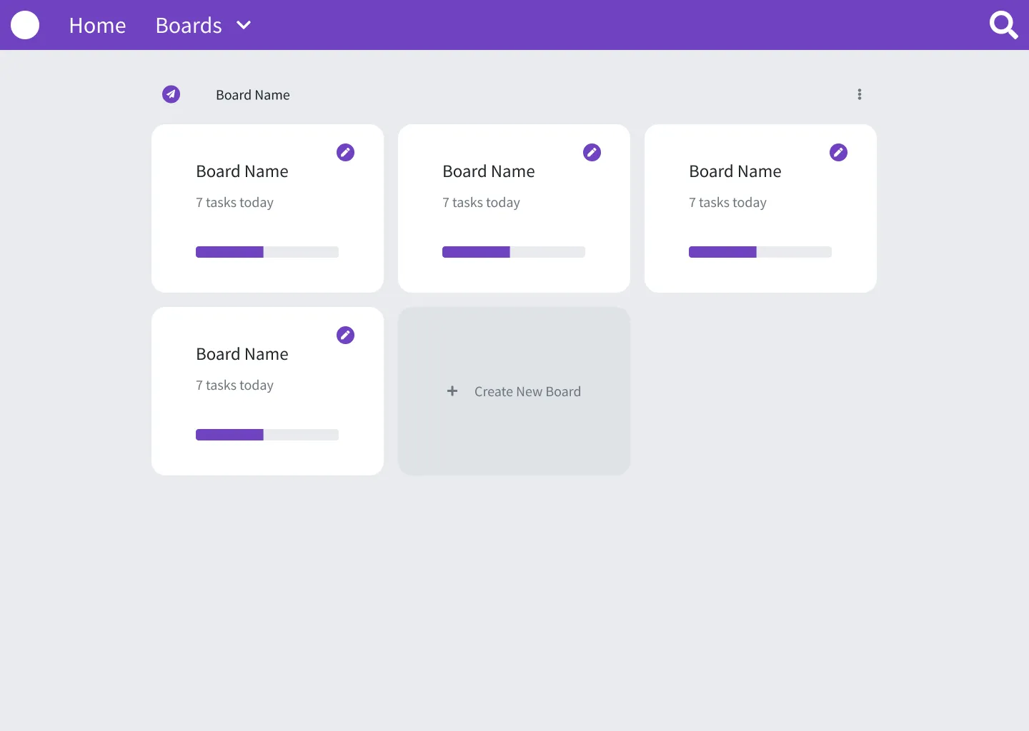
- Board List Components for all screen sizes
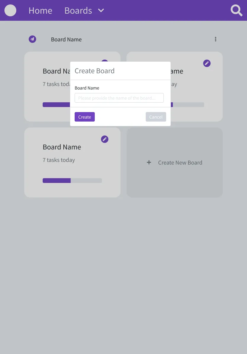
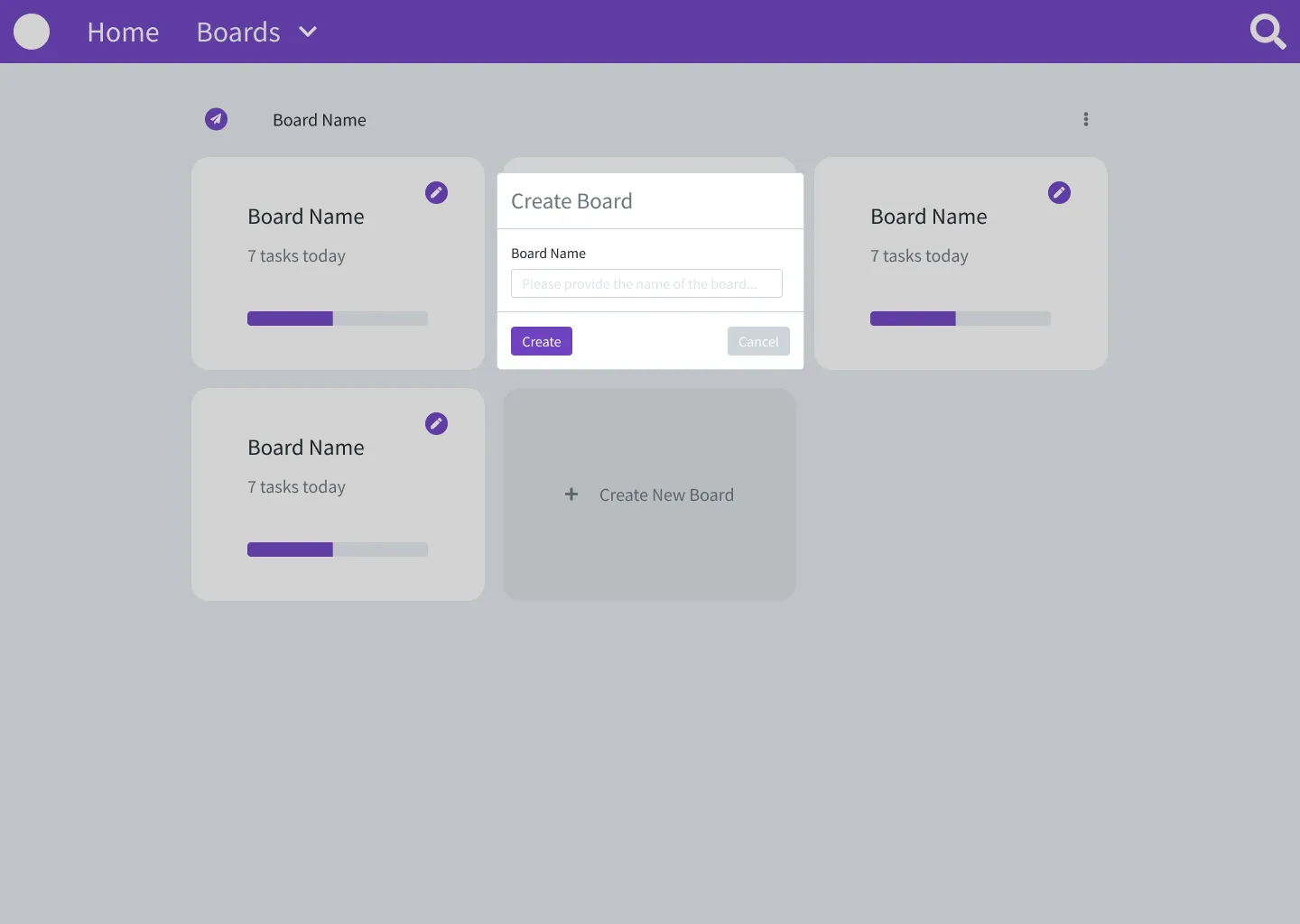
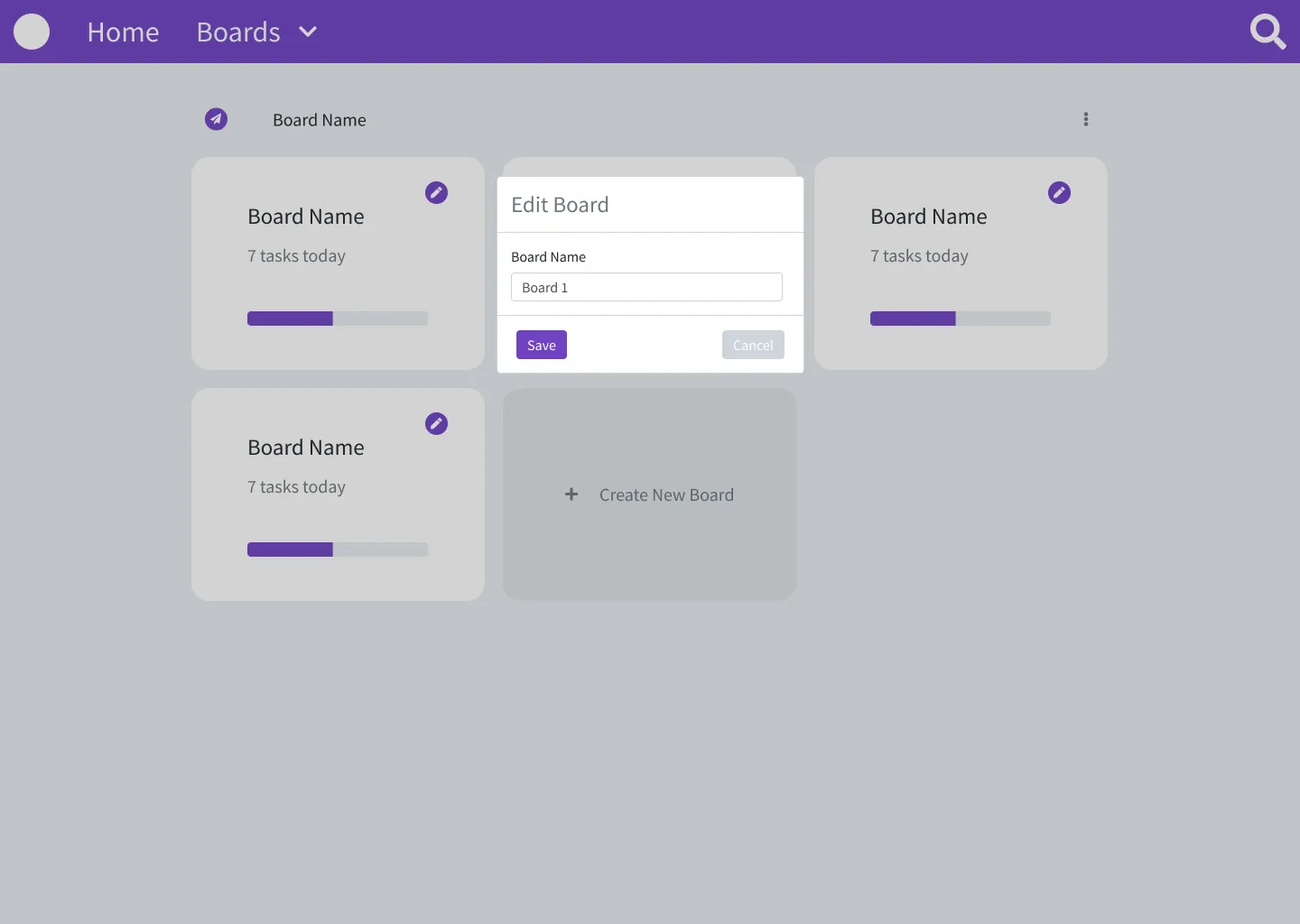
- Various Forms needed by the app
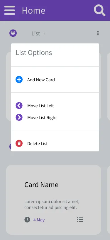
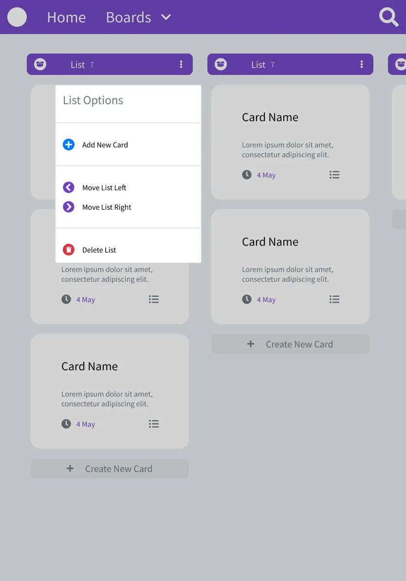
- Options Menus for List and Boards
4. Pages
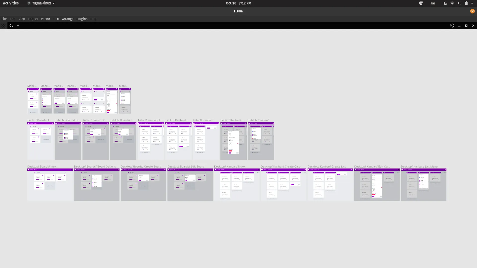
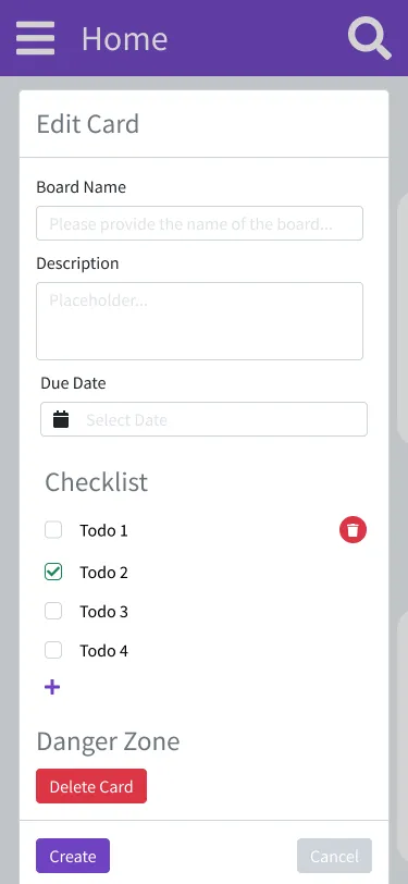
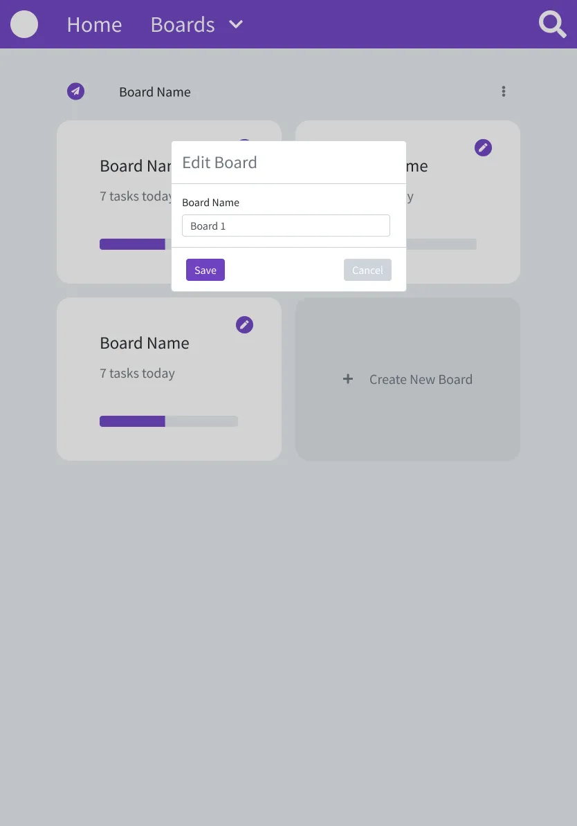
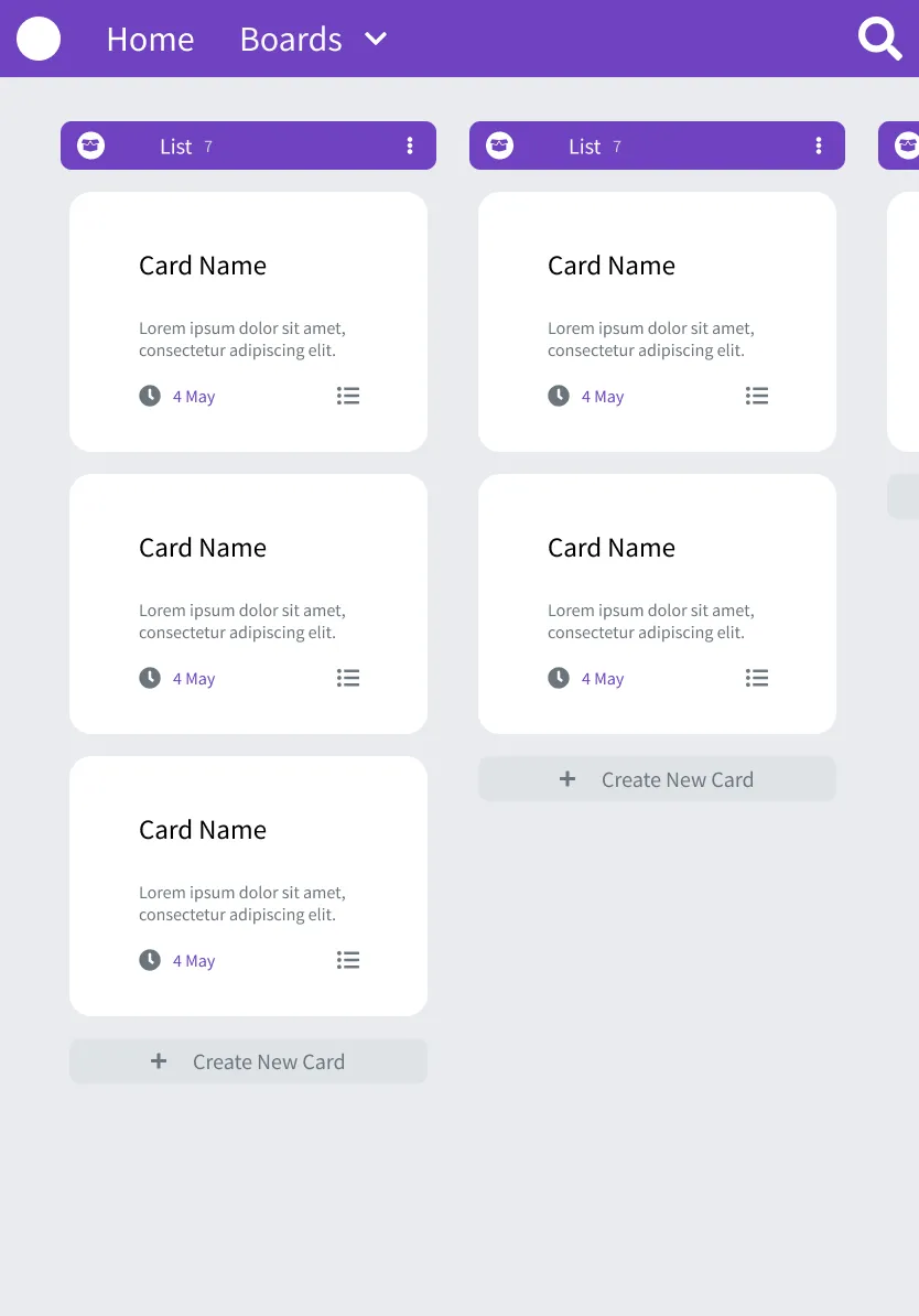
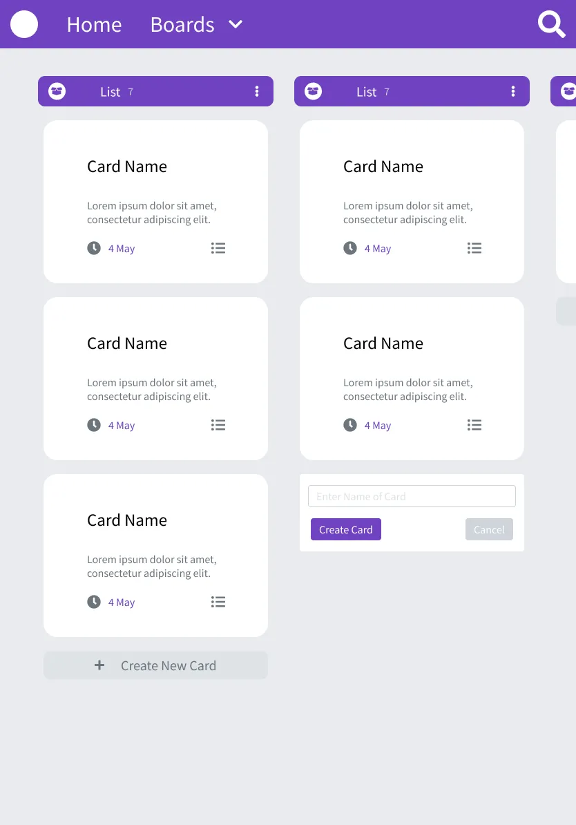
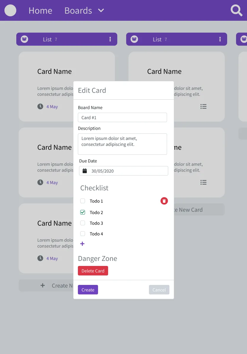
This level is where I put all screens needed by the application.
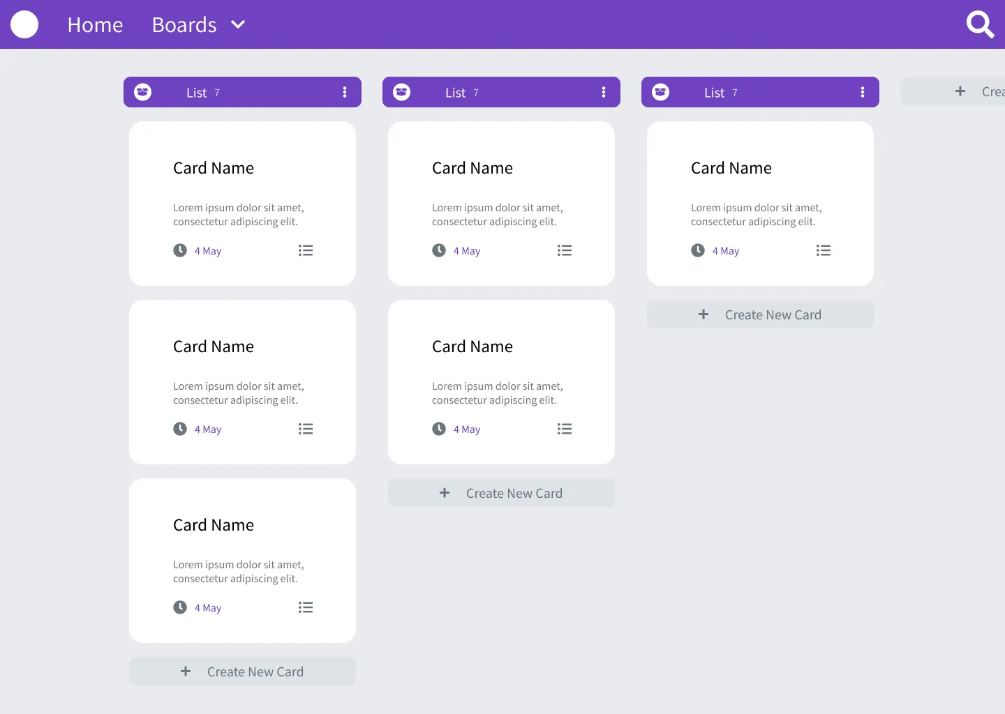
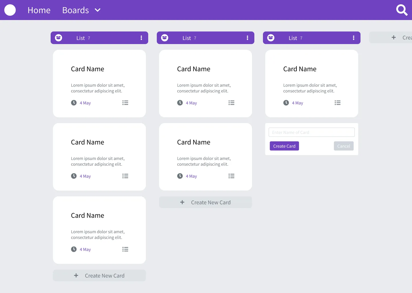
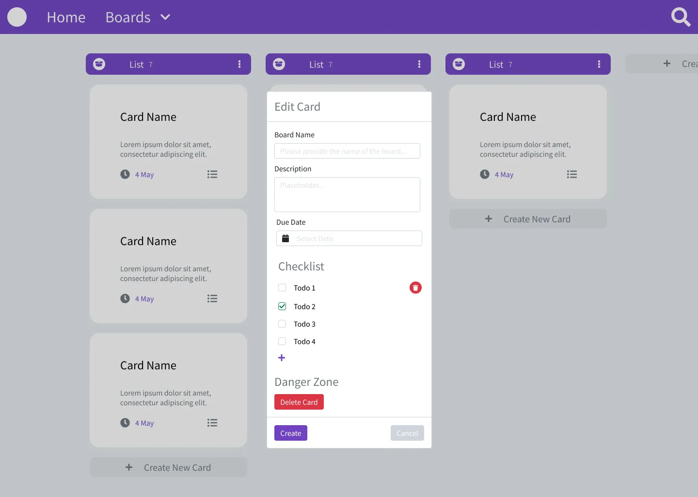
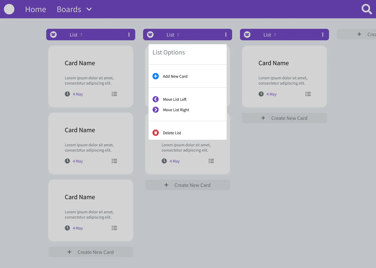
All Screens
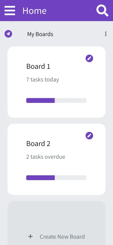
Below are all the screens grouped by target screen size.
Mobile
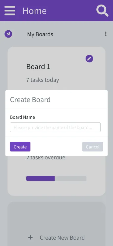
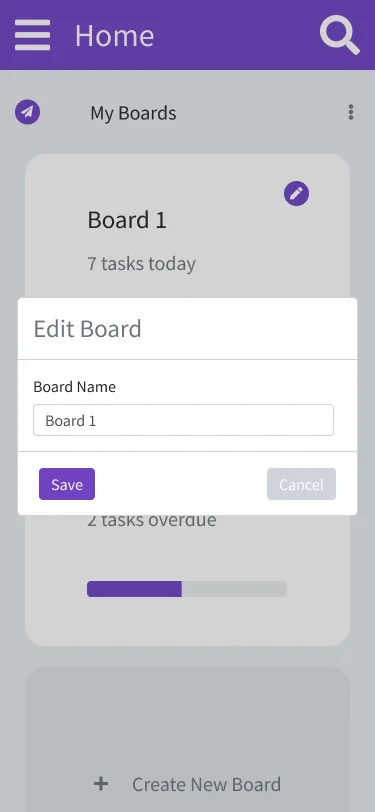
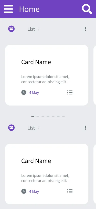
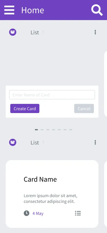
Tablet
Desktop
Conclusion
With the design work done, its now time to focus on development. Depending on when read this, I may or may not be don with development.
Salute 🙂.
